Panel on the right is called inspector, using the inspector you can modify various css styles for selected element without any css knowledge while having real-time preview in the builder.
Element visibility
The buttons at the top of inspector control selected element’s visibility on phone, tablet, laptop and desktop. If the buttons background is black the selected element will be hidden on that device. This helps building truly responsive pages.
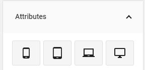
Attributes
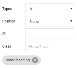
Attributes section of inspector will contain:
- Float – This is basically same as aligning text left/center/right, but for elements instead of text.
- Id – A unique id for selected element, so css cap be applied easier to it.
- Class – All the selected element classes will be listed here, you can remove them by clicking the x icon next to class name, you can apply new custom classes to an element by clicking anywhere on the input (gray background), entering your class name and hitting enter or clicking green check mark. There are a bunch of predefined class that you can use, for example text-danger will make the text color red. You can find more predefined classes here.
This section will also have various other attributes depending on what element you have selected, for example, if you have a heading selected it will have a heading type attribute, so you can choose between h1, h2, h3, h4, h5, h6.
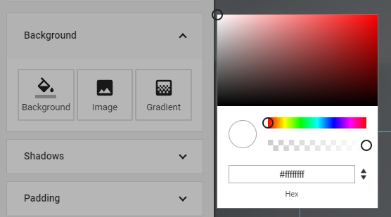
Background
Background section will allow you to set a background image, color or gradient for a selected element.
Color
Click on the color button to bring up a color picker. Here you can choose from over a 100 different predefined popular colors. You can of course select a completely custom color by dragging your mouse in the color palette and selecting a transparency with dragger underneath, you can also enter a color code in the input below.
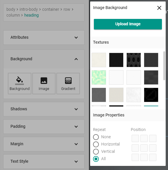
Image
Click on the image button to bring up an image background panel, here you can apply one of over 40 textures included with architect and control the background image alignment and repeating. You can also click on upload image button to upload and use a custom image.
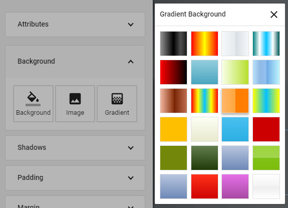
Gradient
Click on the gradient button to bring up a gradient panel, here you can choose from over 30 css gradients included with architect to use as selected element’s background.
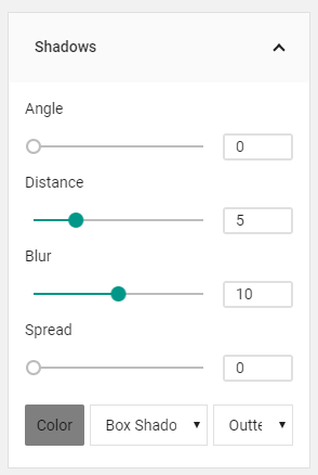
Shadows
You can use shadows panel to apply css shadows to selected element or to text inside it.
- Angle – to control shadows angle, click on the green knob in the circle and drag it around.
- Color – to control shadows color, click on the white square, this will bring up a color picker, same as the one for elements background color.
- Distance – this will control how far away the shadow will be from selected element.
- Blur – this will control how clear the shadow is.
- Spread – this will control how big the shadow is.
- Box/Text – will apply the shadow to either the element box or text inside it.
- Inner/Outter – will either apply shadow to the outside or inside of selected element box.
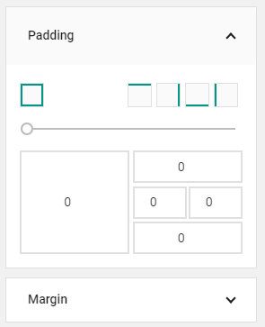
Margin / Padding
Margin controls the spacing between selected elements box and the content outside, while padding controls the spacing between selected elements border and the content inside it.
To use the dragger, first select the sides you want to apply margin or padding to and then drag the handle until you have your desired effect. For a more precise control you can enter your margin and padding values in the input boxes, big one will apply the value to all sides while the smaller ones represent a particular side of element’s box.
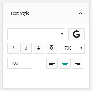
Text Style
This panel controls the appearance of selected elements text.
Font
Click on the font select, to change selected elements font to one of the native browser fonts, or click the G icon to open up google fonts modal, so you can choose from one of nearly 700 google fonts.
Style
Click on of the buttons under the fonts to change text boldness or make it italic, underlines, overlined or crossed-out.
Size, Color, Alignment
You can change text size by entering desired number in the input box, you can click one of the alignment options to align text left, center or right or you can change text color by clicking on the square at the bottom of the panel to bring up a color picker.
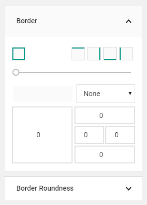
Border / Border Roundness
In the last two panels you can control the selected elements border appearance and it’s corners roundness.
Width, color and style
To change border width and color first select the border sides you want to change at the top and then either use the dragger or input boxes at the bottom to get the desired effect. To change border color click on the square under the dragger to bring up a color picker.
Roundness
To change border roundness, first apply the border you want via the border panel, then select the corners you want to change at the top and use the dragger or enter the value you want in the input boxes.